The canvas module, i.e. the QCanvas, QCanvasView and QCanvasItem and classes inheriting it, are used to display 2D graphics. The graphics can be anything from a classic 2D game to business graphs. The official documentation says this:
"The canvas is optimized for large numbers of items, particularly where only a small percentage of the items change at any one time. If the entire display changes very regularly, you should consider using your own custom QScrollView subclass."
The classes of the canvas module builds a classic design pattern, the model - view. The QCanvas class is a document holding a number of QCanvasItems. Each canvas can be seen through one or more QCanvasViews. This means that the same canvas can be seen through several independent views with different zoom levels, rotations, etc.
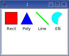
Qt offers a range of canvas items. Some of these items are demonstrated in example 12-1 shown below. Simply put this code in a .cpp file in an empty directory and run qmake -project && qmake && make to generate an executable. The the resulting window is shown in figure 12-1.
#include <qapplication.h>
#include <qcanvas.h>
int main( int argc, char **argv )
{
QApplication a( argc, argv );
QCanvas *c = new QCanvas( 210, 75 );
QCanvasView *cv = new QCanvasView( c );
QCanvasRectangle *rect = new QCanvasRectangle( 10, 10, 40, 40, c );
rect->setPen( Qt::black );
rect->setBrush( Qt::red );
rect->show();
QCanvasText *t = new QCanvasText( "Rect", c );
t->setX( 30 );
t->setY( 55 );
t->setTextFlags( Qt::AlignHCenter );
t->show();
QPointArray points( 3 );
points.setPoint( 0, 20, 0 );
points.setPoint( 1, 0, 40 );
points.setPoint( 2, 40, 40 );
QCanvasPolygon *poly = new QCanvasPolygon( c );
poly->setPoints( points );
poly->setX( 60 );
poly->setY( 10 );
poly->setBrush( Qt::blue );
poly->show();
t = new QCanvasText( "Poly", c );
t->setX( 80 );
t->setY( 55 );
t->setTextFlags( Qt::AlignHCenter );
t->show();
QCanvasLine *line = new QCanvasLine( c );
line->setPoints( 110, 10, 150, 50 );
line->setPen( QPen( Qt::green, 4 ) );
line->show();
t = new QCanvasText( "Line", c );
t->setX( 130 );
t->setY( 55 );
t->setTextFlags( Qt::AlignHCenter );
t->show();
QCanvasEllipse *elli = new QCanvasEllipse( 40, 40, 45*16, 225*16, c );
elli->setX( 180 );
elli->setY( 30 );
elli->setBrush( Qt::cyan );
elli->show();
t = new QCanvasText( "Elli", c );
t->setX( 180 );
t->setY( 55 );
t->setTextFlags( Qt::AlignHCenter );
t->show();
c->update();
a.setMainWidget( cv );
cv->show();
return a.exec();
}
Example 12-1
Figure 12-1 Example 12-1 running.
The classes used in this example are QCanvasText, QCanvasRectangle, QCanvasPolygon, QCanvasLine and QCanvasEllipse. The last four are all inherited from the QCanvasPolygonalItem which is the canvas item class that is the best starting point for most custom items.
When dealing with the polygon, notice that the resulting shape has to be positioned using the setX and setY methods. These methods translate the points, so the (20, 0) point becomes (20+60, 0+10) = (80, 10) and so on.
When creating the ellipse the angles are specified in sixteenths of degrees, hence the ...*16 in the constructor. The coordinates specifies the centre of the ellipse.
Before proceeding to the next example and creating a custom item, a quick look at table 12-1 is recommended. The polygonal item class introduces the properties pen and brush. These are however not used by all sub-classes. This is summarized in the table below, but is also discussed in the detailed description of each item in the official documentation.
| Class | Uses Brush | Uses Pen |
| QCanvasRectangle | Yes | Yes |
| QCanvasPolygon | Yes | No |
| QCanvasLine | No | Yes |
| QCanvasEllipse | Yes | No |
Table 12-1
The second example introduces a custom canvas item, MyCanvasItem. Example 12-2 shows the class implementing MyCanvasItem and example 12-3 shows the changes to the main routine of the previous example.
class MyCanvasItem : public QCanvasPolygonalItem
{
public:
MyCanvasItem( int width, int height, QCanvas *c ) : QCanvasPolygonalItem( c )
{
m_width = width;
m_height = height;
}
~MyCanvasItem()
{
hide(); // Required to avoid segfault - see docs
}
QPointArray areaPoints() const
{
QPointArray res(8);
res.setPoint( 0, QPoint( (int)x() + m_width/4, (int)y() ) );
res.setPoint( 1, QPoint( (int)x() + 3*m_width/4, (int)y() ) );
res.setPoint( 2, QPoint( (int)x() + m_width, (int)y() + 3*m_height/8 ) );
res.setPoint( 3, QPoint( (int)x() + m_width, (int)y() + 5*m_height/8 ) );
res.setPoint( 4, QPoint( (int)x() + 3*m_width/4, (int)y() + m_height ) );
res.setPoint( 5, QPoint( (int)x() + m_width/4, (int)y() + m_height ) );
res.setPoint( 6, QPoint( (int)x(), (int)y() + 5*m_height/8 ) );
res.setPoint( 7, QPoint( (int)x(), (int)y() + 3*m_height/8 ) );
return res;
}
protected:
void drawShape( QPainter &p )
{
p.drawEllipse( (int)x()+m_width/4, (int)y(), m_width/2, m_height );
p.drawRect( (int)x(), (int)y()+3*m_height/8, m_width, m_height/4 );
}
private:
int m_width;
int m_height;
};
Example 12-2
The main is altered in two places. First, the size of the canvas is different, then a number of lines have been added to create, position and label the custom canvas item.
...
QCanvas *c = new QCanvas( 260, 75 );
...
// Custom canvas item
MyCanvasItem *my = new MyCanvasItem( 40, 40, c );
my->setX( 210 );
my->setY( 10 );
my->setBrush( Qt::yellow );
my->setPen( Qt::black );
my->show();
t = new QCanvasText( "Custom", c );
t->setX( 230 );
t->setY( 55 );
t->setTextFlags( Qt::AlignHCenter );
t->show();
...
Example 12-3
The implementation of the custom item consists of five parts. First, the constructor, which is straight forward. The parameters begin with the class specifics and is followed by the arguments passed to the base class. The destructor is also straigt forward. The official documentation for QCanvasPolygonalItem specifies that each inheriting class's destructor must call hide.
The third part is the implementation of areaPoints. The area contained within the returned points must contain the entire shape while being as small as possible. The area returned from this implementation is shown in figure 12-2 as blue together with the actual shape yellow.
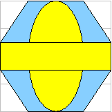
The area and the shape.
The fourth part is the actual drawing which is done in the drawShape member. The painter given as a parameter is setup with the given pen and brush and is translated so that the coordinate set using setX and setY methods is located at (0, 0).
The final part consist of the private variables m_width and m_height. In a proper implementation the width aught to be editable using a setWidth method and accessable through an width method and be declared as a property using the Q_PROPERTY macro. The same of course applies to the height.
The resulting window from the second example is shown in figure 12-3.
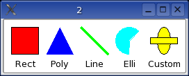
Figure 12-3 A custom shape.
In the third example the canvas view will be altered. A custom version will be created through sub-classing and the resulting class will make it possible to move the shapes around using a pointing device.
Example 12-4 shows the code for the implementation of the custom canvas view.
class MyCanvasView : public QCanvasView
{
public:
MyCanvasView( QCanvas *c, QWidget *parent=0, const char *name=0, WFlags f=0 ) : QCanvasView( c, parent, name, f )
{
dragging = 0;
}
protected:
void contentsMousePressEvent( QMouseEvent *e )
{
QCanvasItemList il = canvas()->collisions( e->pos() );
for( QCanvasItemList::Iterator it=il.begin(); it!=il.end(); ++it )
{
if( (*it)->rtti() != QCanvasText::RTTI )
{
dragging = (*it);
xoffset = (int)(e->x() - dragging->x());
yoffset = (int)(e->y() - dragging->y());
return;
}
}
}
void contentsMouseReleaseEvent( QMouseEvent *e )
{
if( dragging )
{
dragging->setX( e->x() - xoffset );
dragging->setY( e->y() - yoffset );
dragging = 0;
canvas()->update();
}
}
void contentsMouseMoveEvent( QMouseEvent *e )
{
if( dragging )
{
dragging->setX( e->x() - xoffset );
dragging->setY( e->y() - yoffset );
canvas()->update();
}
}
private:
QCanvasItem *dragging;
int xoffset, yoffset;
};
Example 12-4
The constructor simply sets the pointer dragging to null. This indicates that no item is currently being dragged.
The contentsMousePressEvent determines if a click is the start of a moving operation or not by locating any items under the mouse pointer and checking so that the item not is a QCanvasText. The purpose of the limitation is to show how the rtti member method can be used to determine what it is that is being moved. If a valid item is found dragging is set to point at it and the offset variables are set to the difference between the item's hot-spot (i.e. the point which its x and y coordinates indicate) and the mouse's location.
When the mouse is moved the location of the item, if any, is updated. Notice the call to canvas()->update() which is necessary to update the actual view. When the mouse button is released the items position is adjusted once again and the dragging member is nulled again. This ends the movement operation.
To use this view from the main routine it is necessary to change the line creating the canvas view to create the custom version instead.
The code from the last chapter can be downloaded from here.
Qt Quarterly has an article on implementing groupable canvas items.
This is a part of digitalfanatics.org and is valid XHTML.
Copyright (c) 2002-2004 by Johan Thelin (e8johan -at- digitalfanatics.org). This material may be distributed only subject to the terms and conditions set forth in the Open Publication License, v1.0 (local copy) or later (the latest version is presently available at http://www.opencontent.org/openpub/). Distribution of substantively modified versions of this document is prohibited without the explicit permission of the copyright holder. Distribution of the work or derivative of the work in any standard (paper) book form is prohibited unless prior permission is obtained from the copyright holder.